
Spree iOS app user testing report
Introduction
The Spree iOS app is a clone of the Spree mobile website but with native iOS functionality. It is a minimal viable product with only basic functionality. It will allow the user to find products, create an account and to go through the checkout process.
The Spree Customer Service team conducted an on-site usability test using a beta version of the app. Each participant used their own phone and the app was distributed using Test Flight. A laptop using QuickTime Player was used to do a voice and screen recording of each session. A second laptop was used to take notes. The test administrator and data logger were present in the testing room. On some occasions, the iOS developer was also present. The session captured each participant’s navigational choices, task completion rates, comments, overall satisfaction ratings, questions and feedback.
Executive Summary
The User Experience team of Spree conducted an onsite usability test at the Spree offices in Cape Town. The testing period was from 8 to 23 September 2015. The purpose of the test was to assess the usability of the interface of the iOS app.
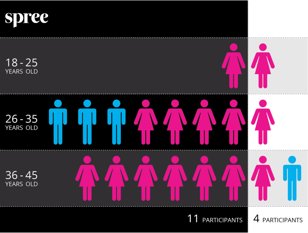
15 people participated in user testing. 11 of the participants were Spree employees that had no previous exposure to the app and four external participants. Each session lasted approximately 30 minutes.
In general, all participants found the Spree iOS app to be clear and straightforward. 93% of the participants said that they prefer the app to the Spree mobile site. 87% of the participants have previously used the Spree website to shop, but only 27% have used the Spree mobile website. All participants were familiar with online shopping but only 47% have used an app to shop.
The test identified a few minor problems including:
- Users did not immediately know how to select a subcategory on the product listing view.
- Users tried to link back to a product from the cart view.
- Not all users could apply the voucher code.
- Filters have a few problem areas, including not large enough hit state, clearing filters have no user feedback.
- Users want the option to view the product as a grid.
This document contains the participant feedback, satisfaction ratings, ease or difficulty of completion and recommendations for improvements. A copy of the scenarios and questionnaires are included in the Session section below.
Methodology
Sessions
The User Experience team sent out an email to all the Spree employees asking if anyone would be interested in doing user testing for the Spree iOS app. Some friends and family were also included in the user test. All external participants had to sign an NDA.
Each individual session lasted approximately 30 minutes. During the session, the test administrator explained the test session and asked the participants a few background questions.
Opening Questions
- How often have you shopped online in the past 6 months?
- What are some of the site you’ve shopped on?
- Do you shop on your phone?
- Would you use an app?
- Do you currently use any apps to shop? If no, why? If yes, where?
- How old are you? 18-25 / 26-35 / 36-45 / 46-55 / 55+
- How long have you had a smartphone?
- Do you shop on the Spree mobile site/website?
- What functions and feature do you expect from the Spree app?
- What are you expecting to see when you first open the app?
The participants were asked to perform ten tasks.
Tasks
- Find a pair of shoes that you like and add them to your cart.
- Share the shoes on email.
- Add any other items you like to your cart.
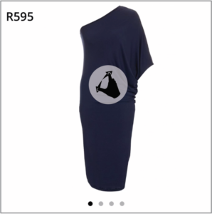
- Is the product image big enough? Can you see enough detail?
- Find a similar item in another colour / similar item that cost less.
- Clear all filter.
- Remove an item from your cart.
- Go back to the home/landing view.
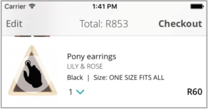
- Checkout.
- Logout of your account.
After each task, the administrator asked the participant to rate the interface by giving it a smiley face, a natural face or a sad face.
After the last task was completed, the test administrator asked the participant a few closing questions.
Closing questions
- What was your overall impression of the app?
- Would you recommend the app? Why?
- Would you use the app again? Why?
- What do you prefer an app or mobile web? Why?
- What would you do to improve the app?
- What could we do to improve our user testing sessions?
Participants
11 of the participants are Spree employees. Only four of the participants does not work for Spree. The test ran over 10 days, starting on 8 September and concluded on 23 September 2015. Of the 15 participants, 11 were female and four were male. The age of the group ranged from 18 – 45 years of age, with eight participants between 26 and 35, eight between 36 and 45 and only two between 18 and 25.
Participates were only selected if they had no contact with the app before the testing.
Results
Task Completion Success Rate
Out of the ten tasks given to the participants, 53% of them could complete all of the tasks. The other 47% could complete all the tasks except for one task, applying a voucher code.
Task Ratings
After completion of each task, participants rated the ease or difficulty of completing the task by giving it a smiley face, a natural face or a sad face.
Finding a pair of shoes, 53% of the participants found it easy, with 40% unsure and 7% did not like it.
93% of the participants were delighted with the size selection, login, zoom functionality. 100% of the users found the logout process super easy.
87% of the participants rated the whole checkout as easy and only 13% of the participants were unsure about how they feel.
73% of the participants were happy about how filters worked, 13% were unsure and 13% did not like the filters.
Overall Metrics
Liked Most
- Product Zoom with lots of pictures.
- Left swipe to remove an item from the cart.
- Size selection.
- Big product images.
- Look and feel.
- The app feels more secure.
Liked Least
- The filter was a bit confusing.
- Hit states in the filter too small.
- No user feedback on the clear filter.
- Images on the second level menu.
- Category selection not clear.
- Would like to see more products on the product listing view – show as 2 up and not 1 up.
- Applying a voucher.
- Logged in / logged out no status have to go into the account to see.
- Pinch to zoom not working on product view.
Doesn’t like the information architecture of product feed.
Recommendations for Improvements
- Add returns and order history.
- Add more curated content.
- Show the number of products available on listing view.
- Highlight top brands.
- Give some kind of incentive to using the app, like a discount.
- Use the user’s current location for the shipping address.
- Show the address on a map as the user types the address.
Recommendations
Below is a list of improvements that should be implemented before the MVP gets released.
Link the image in the cart back to the product view. A few users tapped on the image trying to go back to the product view.
Add couch marks to show the user how to use the category filtering. Most of the users missed that completely. So drawing attention to this feature will ensure that users can not miss it.
Add a pinch to zoom on the product view images. At the moment the user is required to tap on the image to zoom, adding the pinch functionality will make it more intuitive. Some participants tried to pinch to zoom the image.
Move the “Redeem a voucher” link to below the slip on the cart view. Most users missed this completely, so moving it closer to the checkout button will make it more visible for the users.
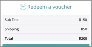
Add the “Redeem a voucher” to the checkout view. We asked the participants where they would expect to find the claim voucher and they mostly said with the payment details. Having the voucher claim in two places will ensure that the users don’t miss it.
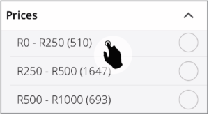
Filters – change the hit state for each item to be the entire row and not just the dot. A lot of users tried to first tap on the word and then only realise that they have to hit the dot. Was very frustrating.
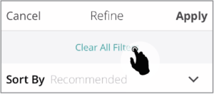
Close the filter when the filter is being cleared. Most users tapped the Clear all filters link multiple time because they did not realise that the filters have been cleared already.
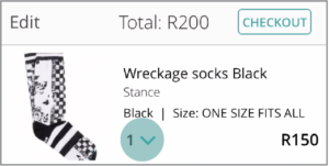
Add a “0” to the quantity drop-down on the cart view. When users tried to delete an item from their cart a few of them tried to change the quantity. This is just an additional way to delete something from the cart.
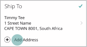
On checkout, change the Add Address to Add/Change Address. Some users found that confusing as they just added an address and then still see “Add address”.
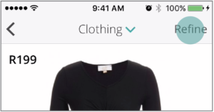
Rename the filter to refine. Having “Sort by” under filter was confusing, refine is a better term to describe “Sort by” and “Filter”.
Have a product count indicator on the product listing. Some users mentioned that they have no idea how long they have to scroll and they don’t want to miss anything.
Have the option to change the product list to a grid view. Some users said they would like to see more products at a time. So give the option to change between the two views.
The following can be improved after we have launched the app.
- Add lookbooks and magazines to the app. This will add curated content to the app.
- Add the account section. This will include viewing your orders and returning products.
- Use current location to determine users address. Using the native functionality of the phone.
- Add product recommendations. Encourage users to shop more.
- Add favourites to the app.
- Improve filters – above some improvements have been mentioned, but filters need more refinement.
Conclusion
Most of the participants found the app easy to use. The biggest issues were claiming a voucher and filtering. We have a plan in place to improve these two areas. Most of the participant said they will use the app again. The recommendations will allow us to launch with a nicely polished app that will fit the requirements for MVP.
CLIENT:
Spree.co.za
CATEGORY:
User Testing